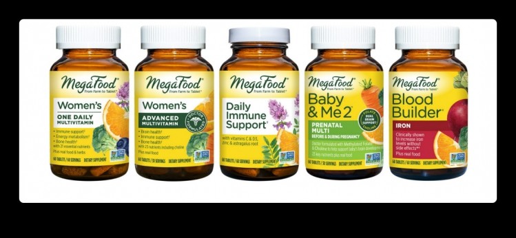
MegaFood debuts new label design

The label refresh aims to enhance readability of product names, features, and benefits, making it easier to find the right vitamins and supplements for any wellness journey
MegaFood recently announced a label makeover for several key product lines to give the brand a more modern look. The new label design rollout has kicked off with the brand’s best-sellers: like Blood Builder Iron, Baby & Me 2 Prenatal supplements and MegaFood Multivitamins with additional products scheduled to hit shelves down the road.
The new design maintains familiar MegaFood visual elements—such as its green brand name, yellow background color and featured real food and/or herbal ingredients—with enhanced readability of product names and varieties, and clear call out of important product features and benefits to make it easier for consumers to select the best product to support their health needs and wellness goals.
Standing out
Matt Smith, VP of Marketing at MegaFood, said the main goals were to refresh and modernize the brand image, as well as to reinforce the distinctive brand assets while broadening the appeal.
Another key touchpoint was to elevate and communicate meaningful features and benefits.
"While our packaging has undergone a refresh, the way we craft our vitamins, minerals, and supplements with quality nutrients and real food ingredients hasn't changed," said Smith. "We're excited that the fresh new look will help put these differentiators front and center for consumers and we look forward to continuing to roll this out to our wide variety of products in the coming months."
Smith added that he wanted to make it easier for shoppers to see and find MegaFood on the shelf and ensure third party certifications, such as non-GMO and USDA Organic were front and center.
“Our core consumers are supplement savvy and highly engaged,” said Smith. “They are solution-focused and look for reasons to believe the product will be safe, healthy and effective for them and their families. They want simple and direct messaging and care about the source of ingredients and how products are made and they expect this information not just on packaging but also clearly communicated on the brand’s site. This level of transparency is vitally important to us at MegaFood.”
Challenges
Smith said the biggest challenge for MegaFood was creating a new design that would appeal to new customers without alienating or confusing current brand users. Another difficult task was Striking a balance between the brand essence and a more modern approach.
“Maintaining current package structure, including materials, with a strong desire and commitment to explore more sustainable packaging options. This is a top priority for us at MegaFood and we are excited to incorporate more sustainable packaging in the near future,” said Smith.
Research
MegaFood executed its own research, which Smith said was key in measuring the new design’s appeal, fit with the brand, upsides and any potential negative impacts.
“Throughout the project, we conducted qualitative, quantitative, and shopalong consumer research studies with both current MegaFood customers and those not yet customers, to evaluate a number of label design concepts and on-pack claims and messages,” said Smith. “This research helped inform final design optimization.”
Helpful hints
Smith said when doing a packaging overhaul, first and foremost, give yourself time. “Packaging is the most important consumer touchpoint and major changes can make or break brands. Don’t rush it. Next, be sure to approach it with the deepest consumer-centricity and empathy—understand the strengths, weaknesses and opportunities of your brand and your packaging to ensure you don’t end up walking away from something that is core to your brand’s identity. Finally, plan for a lot of testing along the way. It’s important to gather consumer input, and vet concepts and messages before you land on the right direction.”


